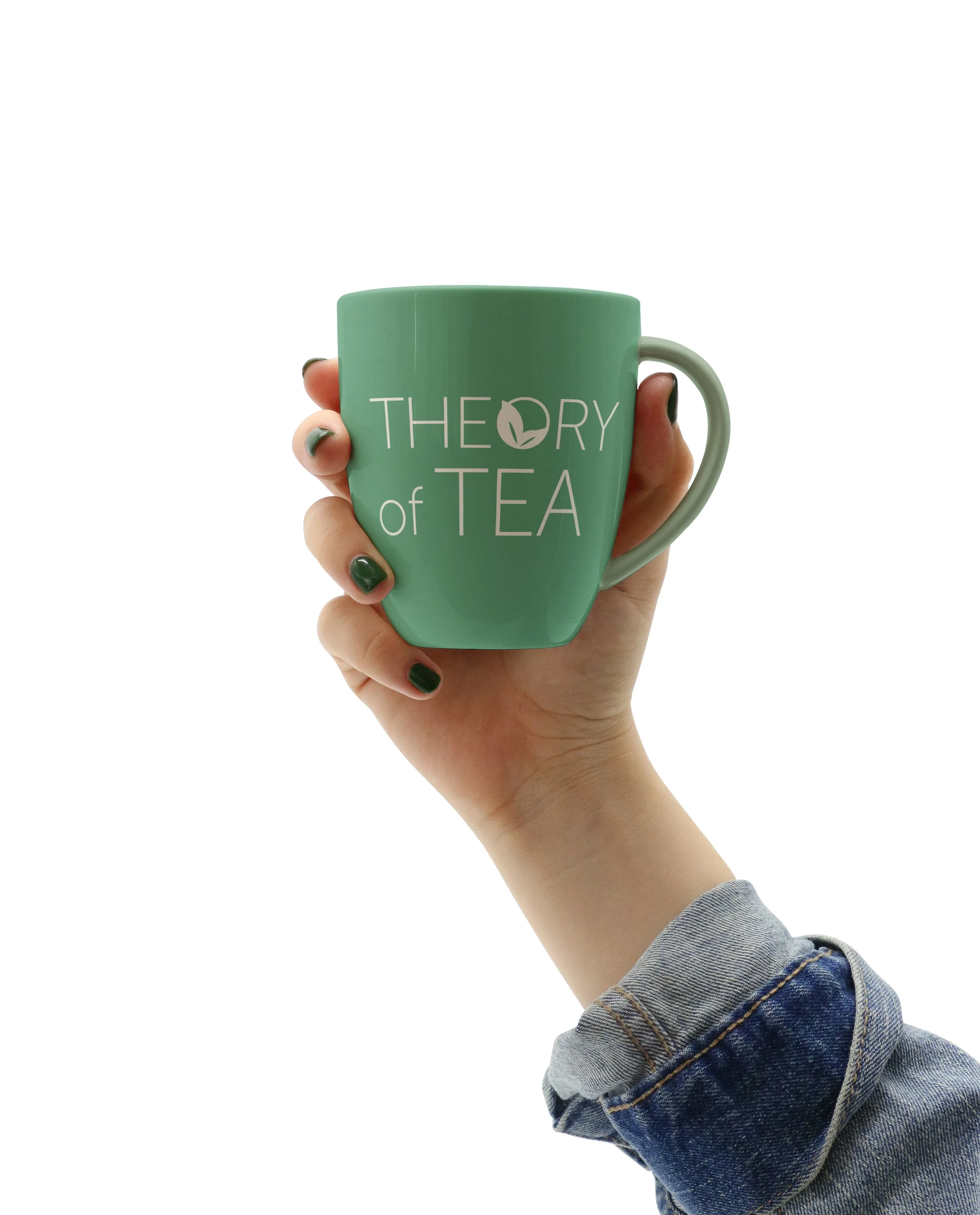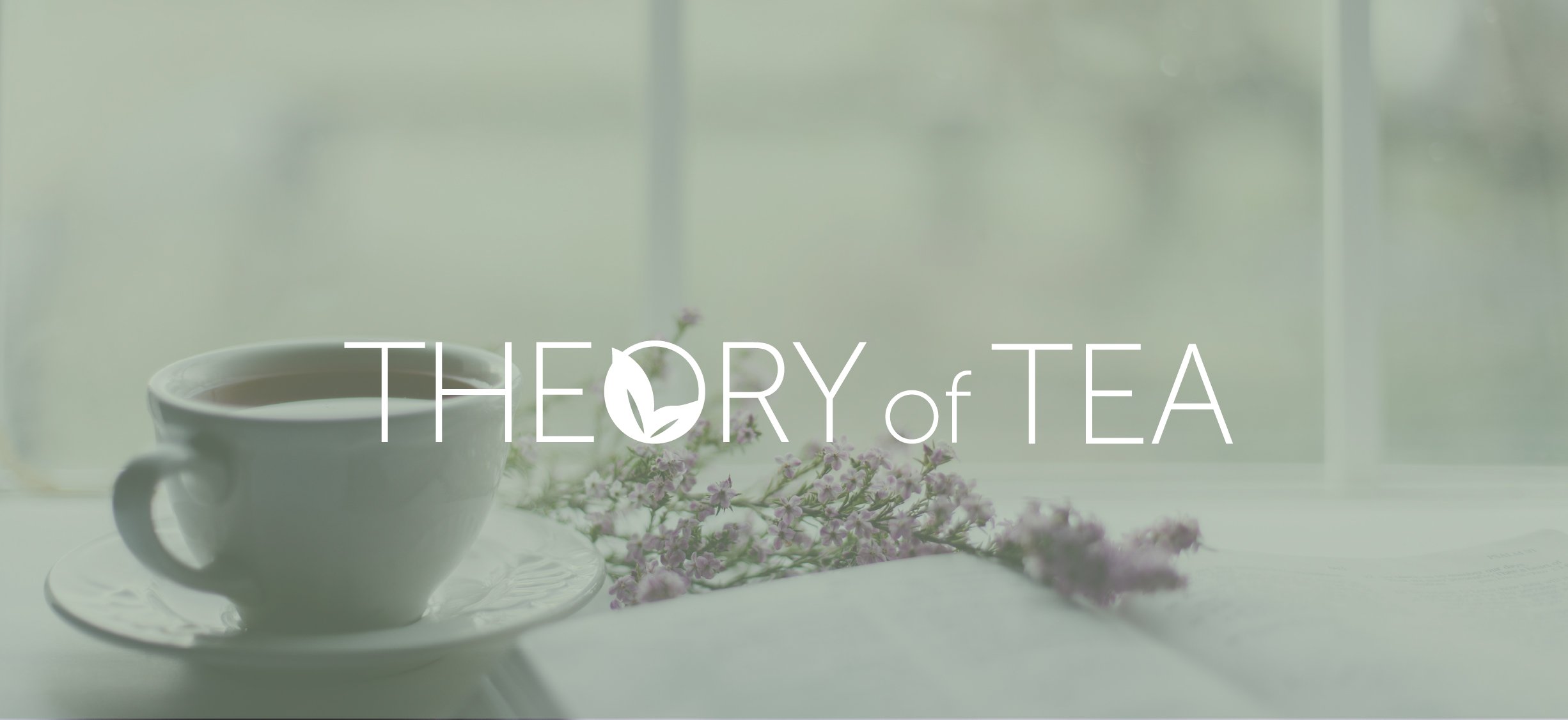
THEORY of TEA
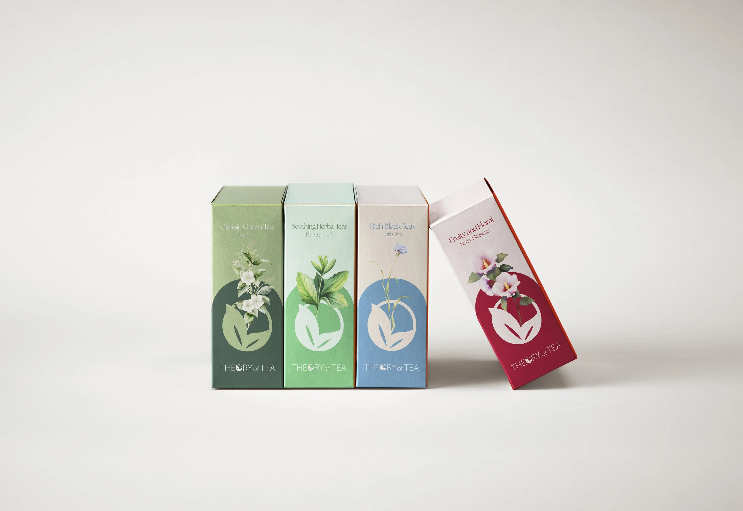
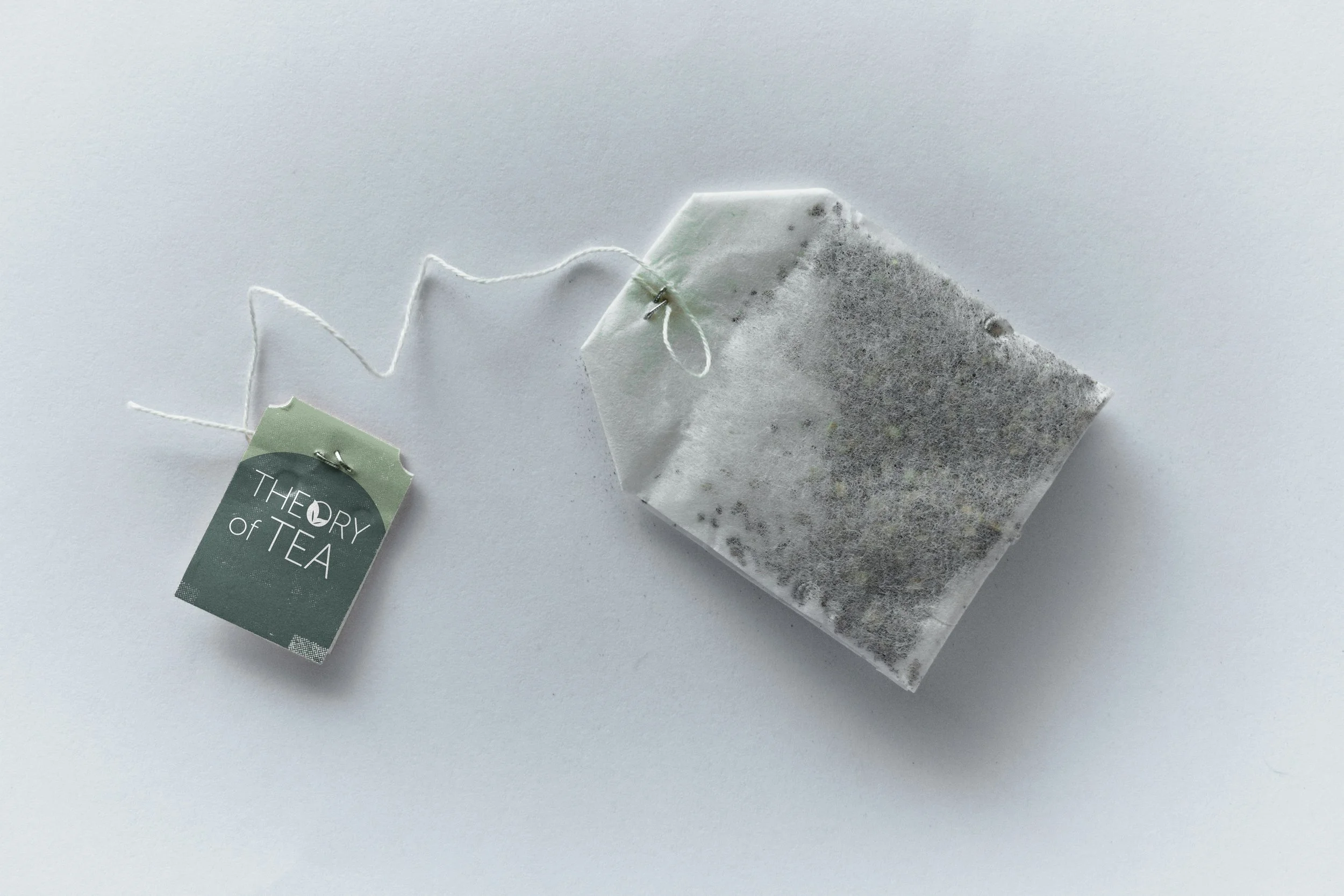
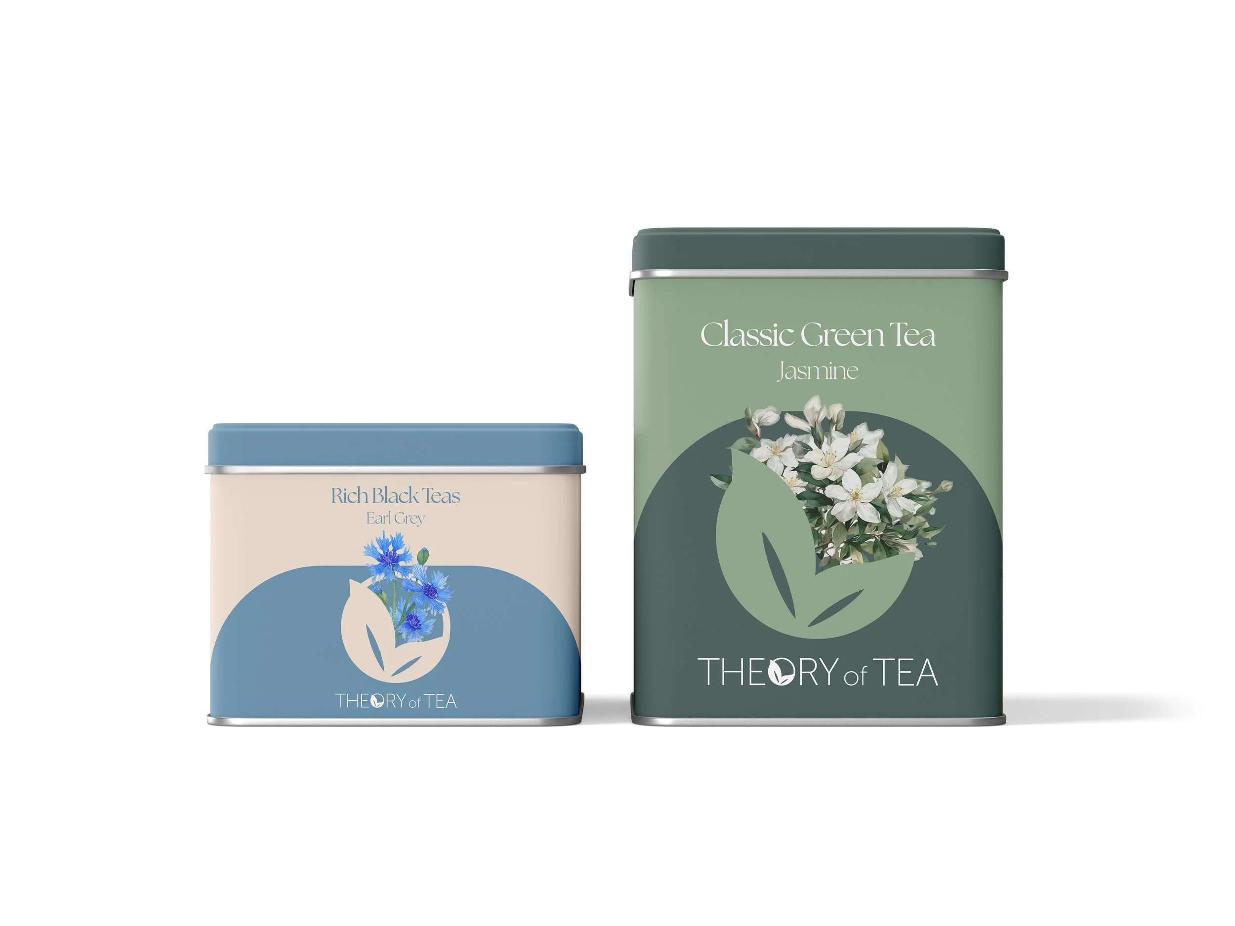
Theory of Tea is a premium brand for people who see tea as more than just a drink—it’s a moment of mindfulness and connection. Each blend is crafted to showcase its origins, delivering rich flavours and exceptional quality. I designed packaging that captures the brand’s mindfulness, purity, and nature values, using soft watercolour flower illustrations as the centrepiece.
Objective
To create an elegant and distinctive packaging design for Theory of Tea that embodies the brand’s values of purity, nature, and mindfulness. The packaging should not only differentiate the product in the premium tea market but also communicate a sensory experience that promotes relaxation, well-being, and appreciation for the art of tea drinking.
Marketing Position
Client
THEORY of TEA, Tea Brand
Category
Theory of Tea is positioned as a premium, nature-inspired tea brand that offers a moment of tranquility in every cup. It stands apart by blending high-quality, organic ingredients with a refined aesthetic, appealing to tea enthusiasts who value authenticity, craftsmanship, and a mindful lifestyle.
Target Audience
Brand Design
Year
November 2024
Health-conscious consumers seeking natural and organic products
Tea connoisseurs who appreciate premium, thoughtfully sourced blends
Mindfulness practitioners & wellness enthusiasts who use tea as a ritual for relaxation
Affluent and design-conscious individuals who are drawn to aesthetically pleasing products
Gift buyers looking for luxurious yet meaningful products
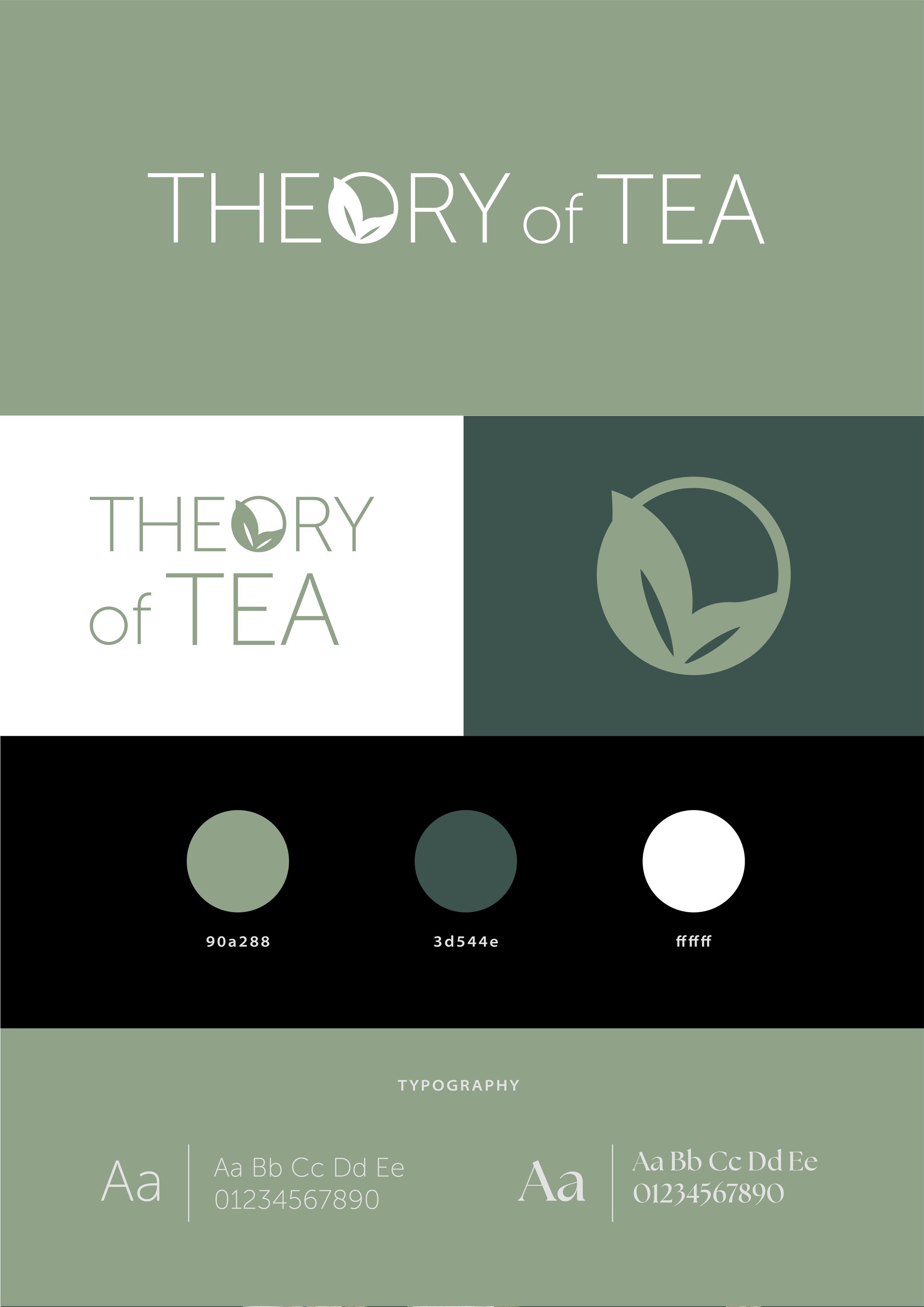
Color Palette
Earthy neutrals (beige, soft browns) – for warmth and authenticity
Soft pastels (sage green, lavender, pale peach) – evoking calmness and harmony
Graphic Elements
Hand-painted watercolor floral illustrations – to symbolize the natural ingredients and purity of the tea
Minimalist botanical line art – adding an organic and sophisticated touch to the packaging
Elegant serif & sans-serif typography pairing – balancing modern refinement with timeless tradition
Gold foil or embossing accents – subtly enhancing the premium feel without overwhelming the design
Soft, textured backgrounds – resembling handmade paper or natural fabric to evoke a sense of warmth and artisanal craftsmanship
Product Packaging
The packaging reflects this philosophy with delicate watercolour florals, a serene colour palette, and elegant typography, embodying nature, purity, and mindfulness. Thoughtful details, from soft textures to subtle gold accents, create a sense of calm and luxury—inviting you to pause, sip, and savour every moment.