Kaikan
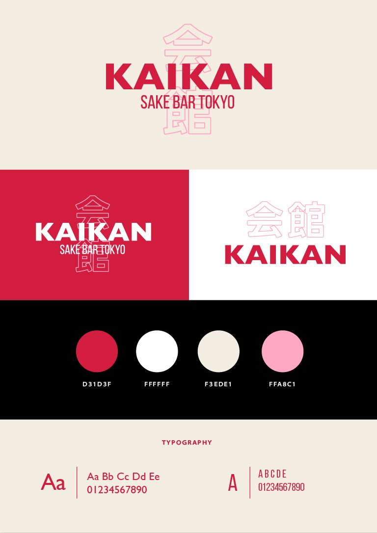
I developed a branding design for Kaikan, a modern sake bar in Tokyo, encompassing logo design, menu, social media, and poster design. The project aimed to capture Kaikan’s vision of blending traditional Japanese drinking culture with a contemporary, stylish experience, creating a bold and inviting visual identity that resonates with customers.
Role
Graphic Designer
Client
Kaikan, a Japanese sake bar
Category
Year
Brand Design
December 2024
Objective
Marketing Positioning
Target Audience
To develop a refined yet approachable visual identity for Kaikan, a modern sake bar in Tokyo that seamlessly blends traditional Japanese drinking culture with contemporary aesthetics. The goal is to create a strong and memorable brand presence that appeals to both locals and international visitors, offering an elevated yet inviting experience through cohesive branding across print and digital materials.
Kaikan is positioned as a modern reinterpretation of the traditional sake bar, bridging the gap between Japan’s rich cultural heritage and the sleek, social ambiance of contemporary bars. Unlike traditional izakayas or high-end sake establishments, Kaikan offers a stylish and accessible space where guests can explore a curated selection of sake, guided by expert recommendations in a design-forward setting.
Urban professionals & young creatives (ages 25-40) who appreciate design, culture, and premium experiences.
Sake enthusiasts & newcomers looking to explore high-quality sake in a modern, approachable way.
Tourists & expats interested in an authentic yet stylish Japanese nightlife experience.
Color Palette
The color choices reflect a balance between tradition and modernity:
Deep Red (#D31D3F) – Inspired by classic Japanese lacquerware and torii gates, symbolizing passion and authenticity.
Soft Pink (#FFA8C1) – A contemporary accent that adds warmth and approachability.
Warm Beige (#F3EDE1) – A neutral grounding tone reminiscent of washi paper and traditional interiors.
Pure White (#FFFFFF) – Clean and minimal, allowing the brand elements to stand out.
Graphic Elements & Visual Style
Typography: A blend of bold, modern sans-serif typefaces and delicate, traditional-inspired fonts for a striking contrast.
Kanji Integration: The use of the 会館 (Kaikan) kanji in a structured, outlined style reinforces the connection to Japanese heritage while keeping the design sleek and contemporary.
Minimalist Layouts: Clean compositions that focus on bold typography and simple, elegant shapes to reflect the refined drinking experience.
Execution
Social Media Post: A visually engaging design that aligns with the brand’s identity, ensuring clear and compelling messaging for promotions or announcements.
Poster: A bold and refined visual piece designed to stand out in both print and digital, making a strong and memorable impression.
Menu Design: A well-structured, stylish menu that enhances readability while reinforcing the brand’s aesthetic and dining experience.


